

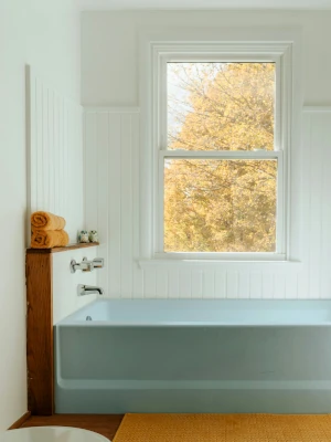
 Every bathroom starts with a set of fixed features—vanities, tubs, sinks, countertops, and hardware—that create the foundation of the room’s visual language. The tones and finishes of these elements help determine which tiles will feel natural in the space. Rather than trying to impose a new palette, work with what’s already present to create a layered, harmonious design. Look for undertones in materials—whether warm or cool—and use those as a guide when selecting tile color and finish.
Warm tones (e.g. wood, brass, beige): pair best with earthy tiles like sand, terracotta, or cream.
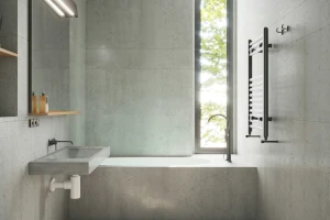
Cool tones (e.g. chrome, marble, blue): work well with slate, gray, navy, or white tiles.
Also consider the positioning of fixtures. For example, if your vanity is directly opposite the bathroom entrance, the wall behind it becomes a focal point—ideal for a feature tile or color accent. On the other hand, cluttered areas might call for more subdued, seamless tile choices to avoid visual overload.
 The size and shape of your bathroom affect how tile choices influence perception. Large tiles can open up a tight space, creating fewer grout lines and a more seamless appearance. In contrast, smaller tiles or bold patterns in a large bathroom can add a sense of detail and intimacy that prevents the space from feeling empty or sterile. Think about how your tile choices will interact with the room’s proportions—both in terms of function and aesthetic balance.
Small bathrooms: Use large-format tiles or continuous floor-to-wall tiling to create visual expansion.
Narrow bathrooms: Horizontal patterns, long rectangular tiles, or light tones can help widen the appearance.
If your bathroom has nooks, angles, or alcoves, consider using those architectural quirks to your advantage. A patterned tile can turn an awkward corner into a design feature, while uniform tiles across floor and wall surfaces can simplify a complex layout.
 A practical rule is to limit your palette to two or three core colors:
Primary color: The base tone used on most surfaces (walls, large tiles). It should make up approximately 60% of the room.
Secondary color: Supports the primary and adds depth (floor tile, cabinetry). It should make up approximately 30%
Accent color: Adds visual interest without overwhelming (mosaics, borders, decor). This should only be 10% of the room.
Try selecting a saturated accent, a duller secondary, and a white, gray or tan primary. Stick to either warm or cool tones within your palette and always test samples in the actual lighting of your bathroom before making final decisions. We offer samples in store you can take home to see how they look before making a final decision.
 Tile color should reflect your overall bathroom palette and help tie the space together.
Floor tiles usually work best in a neutral or muted primary color, but may also go well with a secondary. Darker tones offer contrast but can make small spaces feel tighter.
Wall tiles are a good place for a secondary color or a lighter version of the floor tile. you may choose to include a secondary on one wall, with primary on the others A change in texture or sheen can add subtle contrast without changing color.
Shower tiles can be bolder. You may use richer tone or patterned tile on the back wall, but keep the palette consistent with the rest of the room. You may want to have the shower be a primary or secondary color if it takes up a large proportion of the room
Backsplash tiles are great for accents, slight color shifts, metallic finishes, or simple patterns. Be sure to coordinate with the vanity or fixtures to avoid harsh contrasts.
Grout color matters too. Matching grout blends in for a seamless look. Contrasting grout highlights tile shape but can be busier, especially in small areas.
 Tile size affects how open or crowded a bathroom feels. Large tiles (like 12″x24″) make rooms feel bigger by reducing grout lines. They’re great for floors and walls alike. Smaller tiles work best as accents—in backsplashes, shower niches, or borders. Too many small tiles, especially with high-contrast can look cluttered, especially in tight spaces.
If mixing sizes, use a simple ratio—one tile should be half or one-third the size of the other. For example, 12″x24″ tiles pair well with 12″x12″ or 6″x6″. This will help make your bathroom more cohesive rather than chaotic. Limit yourself to two or three sizes total. Keep grout lines aligned and widths consistent for a clean finish.
 Tile shape brings personality, but subtlety is key. Rectangular tiles (like subway style) are versatile and timeless—great for walls or floors. Square tiles offer symmetry and simplicity. Both are easy to coordinate.
To mix shapes, stick to just two. For example, pair rectangular wall tiles with small hex tiles on the floor, or square floor tiles with mosaic accents. Let one shape dominate, and use the other as an accent. Keep edges consistent—flat edges feel modern, beveled ones feel more tradition-al. Combining shapes works best when colors and finishes stay in sync. Keep it simple, and the room stays calm. Keep in mind, however, that floors should have a matte finish.

